Monday, October 29, 2018

How to Get Your Business on Google Maps: Understanding Google My Business

Google+, Google Maps, Google Search – these are all important pieces of the local marketing and the local SEO puzzle. And now, thanks to the wonderful folks at Google, who have focused on giving small businesses a boost, you no longer have to manage multiple profiles to reach local customers. Google My Business now combines these several essential apps in a single turn-key, all-in-one solution – Google My Business – to have business listings in several different venues at once.

And an important piece of the Google My Business solution is Google Maps, which offers multiple services as part of the larger application, including:

  • A route planner to help travelers get from one location to another
  • The API interface that makes it possible to embed Google Maps in websites
  • Mobile capabilities that utilize GPS systems
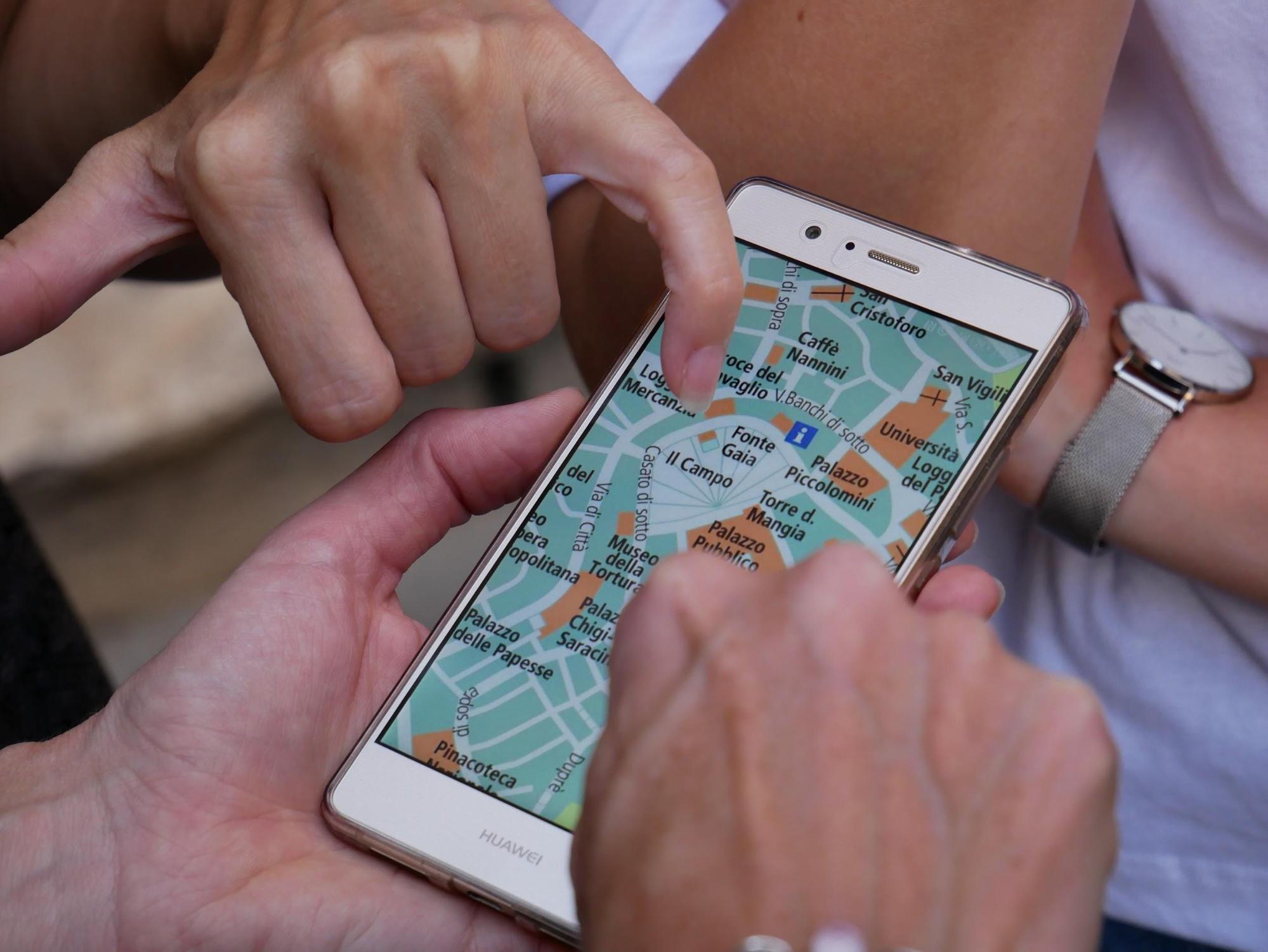
  • Google Street View, which allows users to see and navigate through both horizontal and vertical street-level images of cities
  • Images of planets for astronomy enthusiasts

The Benefits of Google Maps for Businesses

GMB

The benefits of using Google Maps for businesses are numerous, and all of them amount to helping you get found and building that critical relationship with consumers. Consider these benefits: 

Demonstrates Quality and Fosters Approachability

A full 82% of consumers conduct online research before visiting a business, and 43% of all searches are done through Google Maps (Forbes). All those potential customers and clients doing all that searching online can take what amounts to a virtual tour of your business. And this allows them to get a feel for the quality of your business, as well making it seem less remote and more approachable and personable.

Helps Build Consumer Trust

“Establishing trust in an online context is both critical and difficult” for businesses (Inc.). But when you know how to get your business on Google Maps, you’ve taken a giant step toward establishing that trust. Google Maps Street View allows you to put a human face on an impersonal business name. And that’s the beginning of building customer trust.

Allows Better Audience Targeting

Aiming your marketing efforts at a target market is critical, and Google Maps assists you in that. For the 20 petabytes of data Google Maps allows you, there’s plenty of room to add in all the information, including photos and videos, needed to get your business in front of the people who will be interested in it. Google My Business can be a valuable tool in your local marketing and SEO toolbox.

Why and How to Add a Business to Google Maps

google maps

“Why,” you ask, “do I need to put my business on Google Maps?” Because it gets them to your store. Getting your business high in Google’s SERPs gets traffic to your website, but getting your business on Google Maps can get actual foot traffic to your store. It can give you greater, nearly passive brand reach when consumers are looking for specific kinds of local businesses.

So your next question is probably: “How do I get my business on Google Maps?” It’s pretty simple, actually, just four easy steps.

To get your new business on Google Maps, you simply have to add it on Google My Business. But if yours is an established business, it is likely already in place on Google My Business, in which case you just have to claim it. So here’s how it works:

  1. Go to Google My Business and enter your business name and address in the search box.
  2. Click on your business name if it shows up among the suggested matches. If it doesn’t appear, then select “Add your business” and provide the requested information.
  3. Verify your business so that Google can ensure that your business actually exists and is located where you said. (You may have to wait a week or two to receive a postcard with a verification PIN.)
  4. Confirm your business, using your Google-issued PIN, and set up a Google+ page.

How to List Your Business on Google Maps

gmb listing

The way you list your business on Google Maps (and throughout Google My Business) can have a pretty big impact on your find-ability and how potential customers perceive your business when they find it.

First, think about NAP – name, address, phone number – because it can be an important element in local SEO. Consistency is key, so whatever you use here should become your default address all across the web. Further, keep in mind that accurate, highly specific information about your business will allow Google to more correctly classify and better display your business listing.

You will be able to choose a category near the bottom of the Google Maps form. Google uses your category selection to classify your business, and, as a result, it will determine the kind of search query your listing will be served up for. So consider carefully when selecting from among the preset categories/keywords for each industry.

Setting Up a Google My Business Account

gmb account

Properly setting up a Google My Business account is an important first step for effective local SEO. It impacts how well your business will be found online because it connects with a host of other Google apps, tools, and venues – Google searches, Google Maps, Google+, Google Analytics, and various reviews.

The process for setting up a Google My Business account is basically the same as you use to add your business to Google Maps:

  1. Go to https://www.google.com/business/, and then create an account or sign in.
  2. Search for your business or enter it for the first time.
  3. After selecting or creating your correct business type and location, click your business name.
  4. A Google+ page will be created with the information you have put in. You then need to check “I am authorized to manage his business” and then click Continue.
  5. Finally, you’ll to go through the verification process.

Using and Managing a Google My Business Account

manage account

In addition to setting up your Google My Business account and knowing how to how to get your business on Google Maps, you will need some way to manage everything, especially if your business has multiple locations. There are several aspects to using and managing a Google My Business account, the most of important of which include:

  • Setting up your account properly – We’ve already mentioned this, but it bears repeating. For ease of use and management, your Google My Business account must be set up the right way to facilitate management from one central location.
  • Collecting each location’s account information into one place – Name and address for each business location’s website should exactly match what you have in the Google My Business listing for consistency. Google searches will then be able to see them as the same business – and not as competing businesses. A spreadsheet can be an invaluable aid here.
  • Adding new business locations in bulk – To make things easier and to help ensure consistency, you can add new businesses to your account in bulk, if you have 10 or more locations. You can use the bulk uploader, and Google will inform you if there are any discrepancies or errors.
  • Updating business information – Not only is there the first-time entry, but you will likely need to update your business information from time to time.
  • Getting help when needed – This is probably the most important because your job is running your business, not struggling with Google. So if you have any difficulty with Google My Business, don’t hesitate to call on the expertise of a company recognized for its proficiency in results-getting digital marketing and local SEO.

Tools for Optimizing Your GMB Account

optimize gmb

A good agency can help you enhance local listings and manage your account so that your GMB listing is served up to customers looking for a business just like yours. But there are also some good tools you can use to help listings perform better and achieve close to the same results.

Maybe the best and most widely known of these tools is Yext. This tool provides a way to automatically sync your business information across more than 50 directories, including Yelp, Google Maps, and Apple Siri. Yext is what is known as a digital knowledge management (DKM) platform and is used by companies like Taco Bell and Rite Aid to boost brand awareness and engagement, to drive foot traffic, and to increase sales.

Get Visual By Adding Pictures and Videos to Your GMB Listing

visual

For an even greater Google My Business strategy, you can add photos and videos to your GMB listing. They help people find your business and can come from either business owners or customers/clients. Photos, but especially videos, engage potential customers and can be a useful tool for increasing traffic.

Photos can serve different functions on your GMB listing, for example:

  • Profile photos to help consumers recognize your business
  • Cover photos to convey your business’s personality
  • Additional and various photos to spotlight particular features of your business and your offerings

The visual impact of videos, though, is much greater than that of photos. Consider that 85% of Facebook videos are viewed without the sound on (BrightLocal). GMB allows you to upload videos up to 30 seconds long, and, again, these can be added by both businesses and customers. Find out how to add photos and videos to your GMB listing here.

How to Get More Google Maps Reviews From Customers

reviews

The power of positive reviews simply can’t be overstated. And the great thing about reviews is that they take the advantage away from bigger companies and allow smaller businesses and brands to compete, especially on a local level. Here are the three main, tried-and-true techniques for getting more Google Maps reviews from customers:

Just ask – Yep, just ask for reviews. Satisfied customers will be happy to oblige, and you’ll be surprised at the positive results. Asking doesn’t break any rules, and it isn’t in bad form.

Incentivize – Give customers a good reason to leave reviews by offering some kind of incentive, usually in the form of a reward like something free or a discount coupon for the next purchase. Just be sure not to come across as too unctuous or pushy.

Follow up  – Sometimes, it may not be entirely appropriate to ask for a review at the time of purchase, say, if a customer has purchased a vacation package. In such cases, you should send follow-up emails at the right time to ask for reviews.

Contact Google My Business Support to Resolve Issues

issues

Occasionally, you may run into problems – say, error in listing information or bogus negative reviews – and in such cases you’ll need to contact Google My Business support to resolve these issues.

You have several ways available to contact the GMB folks, depending your preferred method of communication and the urgency of your issue:

  • Phone (though reports indicate that phone support is less reliable due to outsourcing)
  • Email (though, again, you may face an indeterminate wait)
  • Facebook
  • Twitter (often recommended for the relatively quick response, usually 24-48 hours Monday-Friday)
  • GMB Forum for help from expert contributors

Adding Your Business to Google Maps . . . and the Rest of the Marketing Puzzle

puzzle

As we mentioned early on, though, it’s really not enough to know how to get your business on Google Maps or how to get your business to show up on Google Maps. You must know how to get your business on Google Maps in a way that will drive local traffic to your business.

But you have a business to run. That’s where Fingerprint Marketing comes in. We understand the digital strategies that will grow your clientele. Our talented team has the qualities you need in a marketing partner. With Fingerprint Marketing, you can “reap the benefits of a sizzling marketing plan.”

Find out how by contacting us today!

The post How to Get Your Business on Google Maps: Understanding Google My Business appeared first on Fingerprint Marketing.


Repost https://fingerprintmarketing.com/how-to-get-your-business-on-google-maps/ fingerprintmarketing</>http://fingerprintmarketing.com/

Tuesday, October 23, 2018

What Makes a Good Website: Everything You Need to Make Your Website the Best

Your website is both your digital billboard and your digital storefront. It has to make a great first impression and has to do a lot of things exactly right. But does it? How many times have you come across a website and thought one (or more) of the following . . .

  • “Hey, this site looks really cool . . . but what is it really about?”
  • “This site has some interesting stuff . . .  but I don’t know how to get around in it.”
  • “I’d really like to buy one of these cool widgets, but this site just makes it too hard.”
  • “I really wanted to read that blog post, but the background and font hurt my eyes.”
  • “I’m not gonna wait any longer for this site to load.” Click

And so on . . .

As you are well aware, a lot of sites have plenty of nifty bells and whistles, some have great content, and few have products you’re just all aquiver to buy. But in the end, neither you nor the site owner gets the desired results – and for any number of reasons.

Many sites just don’t have what makes a good website. So let’s see just what that is.

What Makes a Good Website Design?

banner

At the most fundamental level, there are just four design principles that answer the question “What makes a good website design?” And those principles – or, better yet, pillars that support good website design – are:

  1. A clear and immediately recognizable purpose – When striving for good design, you must always begin with its purpose and hold it steadily in your mind. You have to ask yourself what you want every page to accomplish.
  2. Pleasing aesthetics in line with current standards – A good website design looks good – that is, it is appealing, up to date, and has pulling power.
  3. Well presented content that is both original and relevant – Good design also includes useful, original content that is aimed at the needs of a specific target market and so is relevant. And that content should be offered up in the most effective way possible.
  4. Clear, easy, and intuitive navigation – Ease of navigation matters immensely. The rule of thumb is that any page on a site should be within a maximum of three clicks from any other page on the site.

We could also talk about load speed, mobile friendliness, and any number of related matters. But, really, that is all subsumed under the four foundational principles above.

What Makes a Good Website Experience?

experience

Now, if you go at it from the user end only and ask “What makes a good website experience?” the answer isn’t quite as easy because there is a subjective element. Still, there are some identifiable objective parts to the answer. And because user experience (UX) is so vitally important, it pays to know what it involves and how to design accordingly.

If good UX design has been deployed, users will find a site:

  • Useful
  • Easily useable
  • Desirable
  • Findable
  • Accessible
  • Credible

And here’s how you can achieve those user experience qualities:

  • Design should focus throughout on UX. Everything on and in a site – layout, graphics, text, content, interactive elements – should work together synergistically to provide users a pleasant, quality experience.
  • Users do not read, but scan site pages, so the pages should be constructed so as to be easily scannable.
  • Users want and appreciate simplicity and clarity. Basically, then, you should make it apparent what you want users to do, make it easy to find action buttons, and make things consistent throughout.
  • Design elements should not be weirdly creative, but should be consonant with what users are used to seeing. There is great comfort in meeting the familiar in a new place.
  • You need to know everything you can about your target audience to that you can tailor your website design and make it a good fit for those specific users.
  • Use a visual hierarchy so that the most important elements of the interface are highlighted and user focus is trained there. This can be accomplished, for example, by manipulating size or focal point.

What Makes a Good Ecommerce Website?

ecommerce

This one’s easy to answer: whatever attracts potential customers and converts them into customers. Of course, that isn’t really very helpful, so . . .

According to Neil Patel, here’s what users want in an ecommerce website:

  • A design/layout that is organized and easy to search
  • A fast site, one with pages that take no more than two seconds to load. Studies have shown that increasing a site’s speed increases conversion rates by 78%.
  • A fairly wide, but judiciously chosen, product line. Too wide a range of products and too many products can cause customers to have decision paralysis.
  • Well categorized product pages with brief, compelling, top-level, above-the-fold product descriptions.
  • A comfortable shopping cart with an easy transaction and with no surprises like high shipping fees or limited payment methods.
  • A good post-transaction process, especially with respect to issuance of receipts.

What Makes a Good Product Listing on a Website?

product listing

Product descriptions are of utmost importance here. They have to be concise, tight, compelling, and image conjuring, executed with top-notch copywriting skill. But what makes a good product listing on a website is certainly not limited to the product description(s). It must also include:

  • Category title headers that are both informative and helpful
  • Careful selection of gridview or listview, determined in large part by the kind of products and the desired user experience
  • Careful determination of the number of products per page and per row, based on size of images, number of products, and the amount of information needed for the particular kind of product
  • Quality product thumbnails that work together harmoniously
  • Easy, intuitive navigation for a quality user experience
  • Inclusion of only the necessary product information, but all the necessary information
  • The best sorting option for the kind of products and the target audience
  • Sound on-page SEO

What Makes a Good Website Checklist?

A good website checklist will include at least the following questions and answers:

What Makes a Good Business Website?

Above all, a good business website has a clearly delineated target audience and a clearly defined and recognizable purpose, with everything built around those two things. A good business website also has to do a few critical jobs: 1) inform visitors with relevant, easily assimilable information, 2) keep them on the site long enough to take action by using simple navigation and responsiveness, and 3) convert visitors into leads and then into customers by deploying effective forms and CTAs.

What Makes a Good Website Layout?

A good website layout includes these elements and attributes: appealing and professional appearance, quality and relevant content, quick and correct functionality, usability (which means simplicity, speed, layout consistency, minimal scrolling, easy navigation, and compatibility with different browsers and platforms), and SEO.

What Makes a Good Website Background?

What makes a good website background is simply that which conveys the feel and personality of the business and complements the purpose of the site. Some of the more recent and more effective trends in backgrounds are various shades of gray, geometric patterns superimposed on photos, layers of bright color, abstract art, and asymmetry.

What Makes a Good Website Landing Page?

A landing page is a site page that a visitor lands on after clicking, say, an ad. And, simply put, a good website landing page is one that converts. Still, individual landing pages have to be tailored to work well with different offers. What makes a good website landing page – one that converts – are these qualities:

  • Essential information provided in a concise and uncluttered way
  • High-quality, rich, useful content that inspires confidence and trust
  • Limited exit points (hyperlinks) and a funneling of visitors toward the desired destination/action
  • Ease of conversion through obvious and limited steps
  • A crisp, flawless design
  • Eye-catching, compelling headlines and subheads
  • Flawless, engaging, compelling copy
  • A visitor-centric orientation
  • Easy scannability and use of videos when and where appropriate
  • An awesome, irresistible offer

What Makes a Good Website Header?

Your website header occupies one of the most valuable spots on your site. But with all the conflicting advice and extravagant suggestions out there, it’s hard to know exactly how to utilize the space.

For business-branding purposes, though, it’s pretty simple because the header isn’t quite as critical as in other design cases. In fact, it may be more effective to minimize the header to give content a more prominent position higher up on the page. So the best practice for a business is to keep everything simple, including only a logo and a tagline and thus keeping the header area smaller. But if you want an image in the header, keep it to one main hero image, one that is relevant and that clearly conveys what the site is about.

What Makes Good Content on a Website?

There are so many variable across so many sites that only a general answer is possible here. In general, then, good website content is original, top-quality, relevant, and useful – always providing a solution to readers’ problems.

What Makes a Good Mobile Website?

mobile

What makes a good mobile website is much the same as what makes a good website in general, but with some key differences, including:

  • Pages should be broken into smaller sections.
  • Image scaling is critical.
  • The design must be simplified.
  • A viewport meta tag is needed.
  • Buttons and other elements must be bigger.
  • There should be no pop-ups or refreshes.
  • Text entry for navigation should be minimized.

What Makes a Good Startup Website?

What makes a good startup website consists chiefly in the messaging. And that means that messaging should be clear, to the point, and intriguing. The job of a startup website is to get people’s attention and to stand out from the forest of similar sites.

What Makes a Website Good for Lead Generation?

lead gen

To find out what makes a website good for lead generation, we advert to Neil Patel again. He avers that “leads are only as good as the website that produces them.” That may be overstating the case, but it’s something to keep in mind. Anyhow, here are some tips for creating a good lead-generation site:

  • Be sure to include a contact number.
  • Place sign-up forms on every page.
  • Enhance credibility with testimonials and photos.
  • Speak directly to users in videos.
  • Use legitimate trust seals.
  • Use powerful, impactful, concrete language to describe your offer, not flaccid, insipid abstract words.
  • Stay away from cookie-cutter website templates.
  • Begin with the end goal in mind and keep it constantly front and center.

Be sure to test and then test again and then test some more.

What Makes a Good Website Call to Action?

CTA

First of all, realize that visitors don’t just go from landing on your site to clicking on your call to action (whatever that action is). They have to be led, guided, funneled toward – and sometimes cajoled into – taking that action and often over a period of time and after several visits.

Creating a compelling call to action, one that encourages (and results in a good percentage of the time) conversion, involves several critical considerations. The four main areas of concern for a call to action are:

  • The quality – especially with respect to being compelling and serving to build trust –  of the supporting copy
  • The timing and placement of the call to action
  • The design and appearance of the call to action
  • The effectiveness of the post-call to action experience

What Makes a Good Website 2018, and How Do You Get It?


contact us
So . . . after all this has been said, what makes a good website design? If you distill it down to its essence, you’ll find one main element in that potent solution that remains. And that is user experience.

But getting user experience right for a particular kind of website takes scads of experience and tons of research into target market, the best tools, and current design trends. Of course, you have a business to run and don’t have the time or maybe even the inclination to do all these things. Never fear: Fingerprint Marketing is here.

The web design team at Fingerprint knows that your website has to be nice looking and that it has to help your business grow and make money. That’s why the team is obsessed with making you look good online with a web presence that warms your leads, entices users to visit sooner and more often, and makes it easy for customers and clients to do business with you again and again.

To learn how to get your own well designed website, contact Fingerprint today  . . . and impress your fingerprint on the world.

The post What Makes a Good Website: Everything You Need to Make Your Website the Best appeared first on Fingerprint Marketing.


Repost https://fingerprintmarketing.com/what-makes-a-good-website/ fingerprintmarketing</>http://fingerprintmarketing.com/

Tuesday, October 16, 2018

Web Design Trends 2019: Modern Web Design

The world of web design is easily one of the most fluent, rapidly changing digital branches today and it affects us all in one way or another. Just look at the debates on the new Gmail redesign, and you’ll see some pretty heated arguments on both sides of the fence.

Trends come and go like the tides and seasons, and coincidentally, many trends are cyclical by nature.

The emergence of new tech also prompts new trends – as we’ve seen with flat design gaining prominence to better suit the world of mobile and tablets.

In this post, we’ll be talking about fresh trends, some cool tools to use in back-end and front-end development, new standards being implemented across the web, as well as how certain big players like Google and the EU shift entire industries, including web design.

Current Trends in Modern Web Design

“Responsive” and “flat” would probably be the first terms to come to mind when describing what marks today’s web style.


modern web designWith the rise of mobile devices and Google basically dictating standards, it’s no wonder that responsive and mobile-friendly websites are much more competitive on the search engine results page (SERP).

Here is a list of trends that have marked 2018 and are expected to survive deep into 2019, as well:

  1. Responsiveness – “Mobile First” design
  2. Art and illustrations – prime example: WeTransfer.com
  3. Gradients are making a comeback
  4. Customized icons
  5. Grid layouts (especially broken grids as of late)
  6. Brutalism and Minimalism
  7. Organic curves, and slanted details
  8. Polygons, shapes, and flat geometric patterns
  9. Pop up calls-to-action

Front-end Website Trends to Look Out for in 2019

Unique illustrations and geometry integration are sure to continue to rise in usage.

Depending on the industry, bold type is also going to be a prominent trend as it scales beautifully, adds a dramatic punch to the page, and is easily implementable. Not to mention, there’s an infinite selection of innovative, unique typefaces to choose from.

On that note, a perfect example would be that of Digital Werk. Here’s a prime amalgamation of multiple prominent trends that are expected to continue throughout 2019. An aggressive, but not “in your face” color scheme, video backgrounds, geometric details, and of course, bold type!

This sort of integrative approach to delivering a “punch” to the target audience works beautifully when combined with overall branding efforts, including the logo design itself.

Pair that with a dynamic video or integrated animation, and you have yourself a winning design that will certainly leave a lasting impression.

Pro Tips for Making Cutting Edge Websites

“Good design is as little design as possible” – Dieter Rams

This has been reiterated over and over again, but it’s often misunderstood as a treaty on minimalism and brutalism. This is the wrong interpretation, although thinking this way is justifiable since the quote is coming from a pure industrial designer.

What “as little design as possible” refers to is not the minimally viable product, but a warning not to fall into the mindset of overthinking simple concepts.

If you’re delivering a complex message, then there’s nothing wrong with intricate and complex designs.

But if you want to deliver content in the form of text – that goal takes precedence over everything else. Get the typography in order before thinking about colors, calls-to-action, and backgrounds.

Good design gets out of its own way to bring true usefulness to the end product – the content.

Sometimes, thinking about ways to speed up your site can do much more for the user experience than busting your head over trying out 5 different themes and color palettes. Investing actual time and money into providing the smoothest possible experience to the end user is what is seriously lacking in today’s web design.

Luckily, website speed and responsiveness are important ranking factors on Google, which means that many sites doing SEO certainly have to solve this issue if they want to rank high.

And everyone wants to get to that sweet sweet first page.

Popular and Useful Web Design Tools and Services

We’ve compiled a list of interesting tools and services that should help speed up any web designer’s workflow. This isn’t going to be a debate on Squarespace Vs. WordPress, or Wix Vs. Shopify. But some important updates are worth mentioning:

WooCommerce Shortcodes

With the 2.5 version update, WordPress introduced a nifty feature called WooCommerce Shortcodes, for their extremely popular WooCommerce extension. The Shortcodes plugin allows you to simplify grid customization and more, by adding a drop-down button you can use for all your shortcodes.

Picular

“Google, but for colors”

Now to the fun stuff – Picular is a cute little sandbox for experimentation with themed color palettes. It displays a color palette based on search results upon entering a term, like “sailing”:

picular

Pictaculous

This tool is a match made in heaven for Picular. It works on a similar principle, but the suggested color palette is created based on a picture you input yourself. Think of it as “Google Image Search, but for colors.”

Google Web Designer

Believe it or not, Google actually did a half-decent job with this one, compared to the recent bad UX trends they’ve subscribed to.

(Looking at you, Gmail!)

With Google Web Designer it’s easy to produce a basic HTML5 website, but the tool also allows you to easily create nice ad banners very quickly.

Lightshot

Sharing screenshots, made easy. One of the best, if not the best, screenshot tools out there, and it’s free! Share your ideas and designs fast and easy with remote coworkers. Nagging your friends for feedback has never been easier.

Sketch

This little gem has been around for a decade and it’s still in development, serving thousand upon thousands of web designers. Launching your ideas like rockets – this is probably one of the best prototyping tools a web designer can master – easily!

TinyPNG

Optimize your images without the loss of quality – think mobile first! TinyPNG is a service that many web designers use. Free up to 20 images, 5 MB each, but the service offers a PRO version that removes these limitations.

Balsamiq

This is an interesting wireframing tool that allows you to quickly mock up design frames any time, anywhere.

With version control and collaborative extensions like the Google Drive Add-On, unlock your creativity again, without having to jump through hoops or deal with details and distractions. The ultimate playground for wireframing and conceptual iterating.

The Most Appropriate Website Layout for Your Business

Templates and themes will save you a lot of headaches… but only if you pick the right one. Don’t be frightened, though. Really, there are only several rules to follow when picking a theme or layout for your business, and your choice will ultimately depend on:

  1. The type of business, or type of website you’re building. For example, use full-width content area for creative, and boxed-width area to achieve more of a ‘business’ feel, a traditional sort of look.
  2. The message you’re trying to send and your target audience. This is an important consideration as you can extract certain preferences for the profile of users you’re targeting and use that to cater to the majority. Remember, this may be your website, but your visitors and users are its lifeblood. If it exists solely for its own sake, it might as well not exist at all.
  3. How much time you have to experiment. Hint: you don’t have the time. Experimentation never ends. And neither do trends.

Based on these factors, you will consider using the appropriate font, page width, header, menu bar, color palette, imagery, and of course, let’s not forget the content. If you’re aiming at conversions – landing page copy is just as crucial as all of the other factors combined.

The Do’s and Don’ts of efficient, purpose-specific web design

Do Don’t
Experiment with custom icons, themes, various CMS’s and plugins. Pick a CMS or platform that’s not suited for your type of business (or hobby).
Test! Use every available free test to find flaws, and fix them. Start with Google’s mobile-friendliness test. Overdesign, overcrowd, or overthink superficial details.


“The medium is the message”   Marshall McLuhan

In the context of the internet as the world’s most complex living, breathing communication system – your message to the internet is embedded in your website.

Impressive Homepage Designs to Consider in 2019

The home page is the first thing a visitor sees – a proto-landing page that’s supposed to say everything about your business as fast as a person’s eyes can scan the screen.

A good home page can be a portfolio in itself! Use this fact to catch your visitors unprepared and impress them sooner rather than later.

On that note, here are our top picks for Home Page designs to consider as inspiration for 2019:

Michael Villar

A merger of that Hackers (1995) feel but with a modern touch, this is a solution to definitely look up to if you want to leave a good first impression.

La Shop Studios

Who said you can’t use sound to activate and keep your audience engaged? Website design only has the limits you impose yourself.

La Shop Studios is a breath of fresh air, or in this case, maybe a wave of fresh sound sent to awaken you from the mute slumber of silent browsing.

Tej Chauhan

Here’s a home page with a punch. Boom. No need for words. You already know what this guy does – he crammed his entire personality and brand into the first 5 seconds of looking at his home page.

Dealing With the Trend of Long-form Blog Content in 2019

Walls of text, be gone. Now that internet speeds are reaching half-decent numbers, we can actually afford to cram heavy content into pages without noticeable loss of smoothness.

We’ll talk later about why this technologically-driven bloat trend is bad, but for now, we can just acknowledge that long-form content is getting more extreme and requires some breaking up.

This is, in part, due to the first page of Google search results featuring more long-form results. In fact, content length is one of the major ranking factors for SEO, and many websites are consolidating content into fewer but longer pages.

In many cases, entire blog posts are purposely converted into infographics, to better present complex concepts through visual means.

A picture is still worth a thousand words.

Simplified Layouts – a Clean Message

No more action-crammed sidebars – cleanliness and to-the-point structure is here to save us from the clutter.

Now, this is something to cheer for. Those of us old enough to remember what the internet looked like in the early 2000’s, welcome this trend as a chance to catch our breath once more.

Compare this website with something along the lines of the legendary Ling’s Cars abomination, and you might get an idea of where we’re coming from.

The overall feel is that there might be more text and more long-form content now, but it has never been more of a pleasure to consume. And this is something we’ve all been looking forward to.

Web Typography & Popular Typefaces

Typography is just as important as the content it’s displaying. In terms of chronological order of impact, typography leaves its impression right after the color scheme and imagery used.

It’s the flowers beside the road. But if not properly handled, it is the mud on the sampietrini pavement, detracting from the actual content – the page copy. It can also be anywhere in between, which is where most website designs fall into.

Here are 5 notable and trendy fonts to consider when building a website in 2019:

Roboto

Roboto is a sans-serif open-source giant that rose to prominence just as soon as it was developed by Google. It found its home on the Android system, for which it was designed back in 2011. It’s been available to download for free since 2012. Enjoy!

roboto

Transcript

Transcript is a designer’s favourite no-brainer. It’s a good choice for headlines, but with a feeling of commercial intent and a plethora of variety – 14 styles complete with both Cyrillic and Greek scripts.

transcript

One Day

One Day is a font by Nawras Moneer – a slim modern rounded style with broken lines that convey an almost neon feel, without being too curvy. It’s free for both personal and commercial use, and can bring that outer space touch to tech-related websites and cyberpunk-inspired blogs.

one day

Cardo

We can’t not include at least one serif font. And the trend shows that Cardo is making quite an impact out there. This rich font was created by Google, and serves general content where Old Style is preferred. It’s perfectly suited for scholars, writers, and medievalists.

cardo

Eames Century Modern

Another serif font but with a completely different message. Made in 2010, this modern aesthetic font offers truly remarkable functionality in web design. It’s an oddball mix between Clarendon and Skotch, tossed into a single contemporary blend of mid-century household warmth.

eames

Keeping Your Website Fluid and Responsive

Newcomers to web design might find responsiveness optimization hard to master, but it’s important enough to dedicate time to learn. It has already become a necessity and future trends will follow this trajectory. If you want to rank on Google, responsive design is an integral part of SEO, as website speed will influence a plethora of other factors and user behavior indicators of whether your web page is good enough to be on the front page.

The number of mobile searches has gone up ever since web developers started implementing mobile-friendly design solutions:

  1. Flat design
  2. Google’s Accelerated Mobile Pages (AMP)
  3. Image Optimization

And Yet Web Pages Are Still Getting Bigger?

Despite responsive design taking off like a rocket, the overall trend shows that web pages are getting bigger by the hour. The reason we don’t notice is that technology advances so fast, and with advanced processing power and faster internet, we just don’t notice the bloat.

This trend is also known as the web page “obesity” epidemic.

Web developers, just like programmers, adapt to this technological advancement by letting sloppy code, and unoptimized solutions pass Quality Assurance.

So what if the web page loads 0.5 seconds slower, you might ask? It’s not a matter of speed anymore.

This ever-expanding sloppiness leads to ever-harder maintenance problems, dependency issues, security holes and many other serious issues for user data protection and back-end development.

Where this trend will lead us, no one really knows. And maybe that’s for the best, but we have to keep trying to make clean back-end solutions. We’ve been really successful in doing so for the front-end.

Lessons From Google’s Gmail Redesign – the Good, the Bad & the Unnecessary

Since we’ve talked about responsiveness and bloat, the time has come to turn our attention to Google.

If you’ve been using DoubleClick, Google Ads (former AdWords) or Google Analytics, you might have noticed that the services get slower with each new upgrade. Well, they’ve left the best for last – the long-awaited Gmail makeover is finally locking us away from the old user interface, so you’d better get used to it.

Although many like to call the new design “minimal”, it certainly doesn’t lean towards that side of the spectrum, at least compared to the old Gmail user interface (UI).

There are good sides to this overhaul, as you might have heard:

  • Self-destructing emails for when you want to hide something… from Google?
  • Google Apps sidebar integration
  • Dynamic pop-up actions (hover actions)
  • Email Snooze and “Smart Reply”, and much more…

gmail

GDPR as a Web Developer’s Priority in 2019

The General Data Protection Regulation (GDPR) is a directive serving to protect the personal information of citizens in the EU.

If you’re in any way keeping visitor or user data, be very careful what plugins and beautification extensions you apply. Whether you like it or not, your website’s UX and visual detailing is subordinate to user security. Since almost everyone today is using someone else’s code, it’s always the website owner’s duty to ensure that their website is safe to use.

Front-End Security is as serious as it ever was, and since website building is becoming more modular and simplified, we’re expecting that web designers will be able to operate all-in-one website building solutions. This means they’ll need to at least know the security part of the web developer’s job. Otherwise, if vulnerabilities slip through, it can get pretty expensive, pretty fast, at least in the EU.

A web developer, and by extension the web designer, need to assess the risk factor when choosing a platform to use for the website they’re working on. Shopify, Squarespace, Wix, and WordPress are popular solutions, but depending on the type of business, the cloud-based platforms might not be suitable.

Security-wise, there have been multiple critical failures of cloud-based website building services. Both Wix, WordPress, and others have had such debacles.

Giant Steps From Old-school 90’s Web Design

It’s easy to overlook the obvious when you’re born into it. For those of you just discovering the world of web design, it’d be good to get a glimpse into the history of this amazing industry, if only to realize how much has been accomplished since the dawn of the World Wide Web. And maybe observe some mistakes that we haven’t gotten rid of to this day.

If you compare back-end and front-end web development over the years, there is an inverse trend between the complexity of one and beautification of the other.

Old back-end web developers were dealing with relatively simple code, the websites were compact and fast. Well, they would have been blazing fast with today’s internet, but with 56K – not so much.

In contrast, modern web design tends to rely on many abstracted services content management systems (CMS’s) and API’s, removed from the actual website owner/maintainer and used as a rentable service.

The back-end system has never been more complex, but the front end has the potential to be the most gorgeous it’s ever been. So why isn’t the whole web gorgeous? There’s some food for thought…

Some of the ugliness of today’s web design actually stems from the technical side of things. By trying to make everything more modular, more accessible, more customizable, and a just a few clicks away, the underlying structure of today’s web design (what developers refer to as the “back end”) is built on programs and libraries that are arguably more complex than ever.

It’s ironic to think that the more “simplified” the tool, the more robust the back-end has to be.

The positive side of this trend is that we went from web pages straight out of MS Paint…

ebay

…to cleaner web pages that have grown up to be stylish and at least half-decent looking – and most importantly – easier to navigate:

ebay

If the word “progress” in web design could be summed up in two pictures, these would probably be the top candidates.

Fresh Website Header Design Ideas for 2019

Saving the best tips for last.

There are a couple of simple rules to follow when deciding on an appropriate header design.

A couple of trends have certainly proven how a good header can have a huge influence on the first impression. Here’s our top 3 tips:

  1. Deliver a direct message

direct msg

Simple and efficient is the way to go in this case. In this case, the primary action the user performs is domain search, so that‘s what’s presented as the visual priority.

Depending on your business, you might not need the standard “About Us / Services / Contact“  structure for the header. If it doesn’t serve your brand identity or type of business, then don’t box yourself in these types of molds.

2. Enforce the rest of the content

Maybe the landing page copy should be the primary eye-catcher. You can still use the header as an auxiliary function. Just blend it in instead of making it scream out:

protonmail

Protonmail does a fantastic job at this. Their landing page copy takes priority and the header is just there to blend in and provide some specifics about their values, services, and business model.

Notice how they have “Security” and “Enterprise” listed as separate categories. It’s the most direct and elegant way of showing the specifics of your business and your expertise. Use the chance to list out the psychological benefits of your service.

3. Tickle the user’s imagination

everywhereist

There’s nothing stopping you from using custom assets – artists and creative businesses use this to bring back that sparkling imagination that’s missing from a lot of template-based websites nowadays.

Just look at those fonts, the icons and artwork, the color scheme… It’s the chalkboard feel of good old days – all of those feelings crammed into a single page.

Don’t be afraid to be playful, if that’s the type of business you’re in.

How to Stay Ahead of the Curve with Your Website in 2019

Website design is ever-changing. Google’s search results are ever-changing. How could you possibly keep up? And how do you design and develop a website that represents you and your unique business? It’s a lot for a company to manage on its own.

That’s why you should book a free 15-minute consultation with our experts. Our specialty is creating a unique web design for your business – that’s what we do. Regardless of the latest design trends, we focus specifically on what makes your business unique. And then we design a custom-tailored, business-specific site that accentuates your awesomeness and impresses your fingerprint upon your customers.

The post Web Design Trends 2019: Modern Web Design appeared first on Fingerprint Marketing.


Repost https://fingerprintmarketing.com/web-design-trends-2019/ fingerprintmarketing</>http://fingerprintmarketing.com/